 Most retailers we’ve been working with, spends fortune in terms of time & energy, trying to extract the most out of their retail space. A good store design results in great store layout, which yields far more revenue per square feet than the average store. Still I’m surprised how many stores fail to utilise the basics of a decent retail design. In this post I’ve tried to outline eight basic factors which help to use the retail space more effectively.
We know that not all areas of a store yield the same revenue and profit. In fact, most stores we have observed, have been shown to exhibit an 80/20 distribution, also known as the Pareto principle, where 80% of the revenue comes from 20% of the area.
The essential point is that while costing a fortune, large areas of the store add nothing to the overall bottom line.
The potential in this case is clear. A store layout that will use its space wisely, can increase sales and revenues without increasing expenses.
Our first step towards best using the space, is to identify the most profitable areas which already exist in the store. Our second step is to expand those areas, where successful customer-product engagement happens, by creating customer traffic which covers as much store area as possible.
I’ve listed eight principles to help improve customer traffic as well as increase revenues.
Principal #1 – identifying and placing your staples
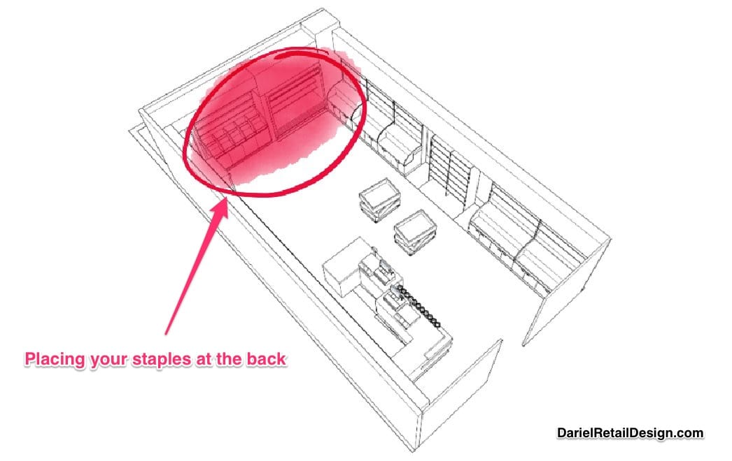
Experienced retailers have been using staples to increase sales for years. staples are sold in large quantities daily, and are the customers’ necessities. Usually products of high demand have lower profit margins. We all know examples such as, bread, milk, and eggs for grocery stores, but not all of us know that every retail vertical has its own ‘high-demand’ products; these could be the cigarettes in a kiosk, the sodas in a convenient store, or the over-the-counter medicines in CVS.
Accurate identification of staples can help create better in store customer traffic. In most cases, it is better to place these products in the back or central part of the store, thus encouraging traffic deeper into the store.
Principal #2- creating a clear view or trail marks towards the staples
it is not enough to place staples in the back. It is also recommended to help customers locate and move towards them. It is essential to leave “hints” or clear view of the product for the entering customer. I have encountered a few store owners who claimed that staples should be hidden, so that the customers would have to look for them. In these modern times, where competition in retail is tremendous, and customers have endless options, my recommendation is to avoid doing that.
Modern consumers are extremely busy and have plenty of other things to do. Most of them do not have the time to play hide and seek with the store owner. Hiding staples can lead to less purchases, and later to less visits in the store, when the customers choose to find an alternative.
Principal #3 – counterclockwise customer traffic
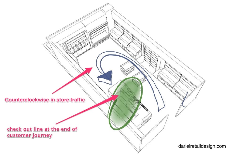
The ideal store layout will direct the customer to the right side immediately upon entering the store. The reason for our right-side tendency is not because we drive on the right side, but the fact that 90% of the population is right-handed. It is easier to shop with your right hand when you are right-handed. Moving counterclockwise will position the customer with his or her right hand toward the store’s side walls (where most shelves are located, and there’s higher exposure to myriad of products) and will make it convenient for them to pick and take the products.
pharm stores are an excellent example for this technique. No matter which branch you walk in to, whatever shape or size, you will always enter the hair color (type of staples for women who use it) and toiletry aisle first. Entering that aisle will usually determine the rest of your path in the store.
Principal #4 – strategic placement of registers and check-out line = +15%
The cash register or POS is usually the last station of the customer in the store. Therefore, it is naturally the finish line of the customers journey in the store. The location of the POS affects the path greatly. If we want to create a counterclockwise traffic, we should place the register at the leftmost side of the store. Placing the register on the right side will drive the costumer to the opposite direction (clockwise – left hand toward the side walls).
In our experience, an average of 10%-15% increase in revenue happened, when we moved the registers from the right side to the left, while leaving everything else as it was (staff, location, products).
In the fashion world, it is common to place the counters in the back of the store. The reasons for that belong to functionality and design concepts, and in that case, the traffic movement directionality should be adjusted, to expose the customers to the left side of the store.
Placing registers on the left and directing traffic counterclockwise
Principal #5- aisles hierarchy
To motivate customers to walk around the entire store, it is recommended to create comfortable movement paths, and equally important, paths that minimize the customer’s decision making process. A natural and sensible path will motivate most customers to follow it, cover most store’s areas, and be exposed to a good variety of products.
One of the best ways to create such path is using hierarchies. Leading aisles and secondary aisles.
We all know this idea from supermarkets and big box stores, but this idea can also be applied in smaller 500 and 900 sq. ft. formats.
The way to create clear paths is first by using shelving and displaying elements, to create optimal movement path. The directing of the costumers happens through creation of unquestionable hierarchy between ‘highways’ and ‘sideways’.
Another way to create a leading path is by placement of bestselling products, that are most customers’ common denominators, along the ‘highway’, to save shoppers time. In the same way, specialty and niche products should be placed along the “sideways”.
Some argue that it is better to place popular products in ‘sideways’. In my experience, it might work for staples, but anything with average demand should be placed on a ‘highway’. It may sound like missing an exposure opportunity, but in modern world’s busy and hurried routine, it is the better policy for the long run.
Principal #6 – identifying ‘cold’ and ‘hot’ spots
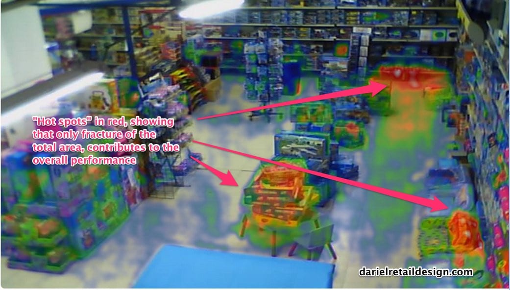
Eventually, every store has its ‘hot’ spots, where traffic is maximal, and its ‘cold’ spots, where customers seldom go.
You can follow the traffic by observing the store, or looking at security footage. The disadvantage of these methods is that it takes a lot of time and patience, which are both hard to find in the retail industry.
Today there are a variety of tools that allow us to examine customers traffic, and adjust the location of shelves and displays, and the way products are arranged. These tools help improving the traffic path and the customer-product engagement, and allow retailers to update their layout regularly. Photo Analytics provides a quick and immediate feedback regarding customers’ responsiveness to the store’s new arrangement.
In the next few years we predict an exponential growth in the use of these tools, to plan and organize store spaces accurately.
Similar to security cameras, that were once used only by security agencies, and are now everywhere, this technology is in the process of becoming more accessible and affordable, and my prediction is that within a few years it’ll be a must have in every retail business.
Combining these tools with sales reports analysis can generate a system that creates high speed optimization of products and elements placement.
Principal #7- creating hotspots to direct the traffic
Every store has hotspots. Not to confuse with ‘staples, hotspots are areas where products have common factors on the shopping experience level. it can be the deli in the supermarket, the electric power tools in a hardware store, or the Disney branded disposable cutlery in Party City.
Hotspots can be utilized to direct customer traffic and attract them to certain areas, or to lead them to a path which includes the hotspot, either somewhere in the middle or towards the end. The correct use of hotspots is a type of art. The advantages of wisely utilized hotspots are stimulating the customer’s interest, improving the shopping experience, and in the right location, encouragement of extra purchases of products located on the way to the hotspot.
Principal #8 – creating clear stopping and lingering spots
It is best to create a path with clear breaks. The customers should not have to marathon the entire store. Nowadays, we can calculate the ‘average dwelling time’ of a customer in the store. When we learn how to calculate the optimal path length, we will be able to calculate the amount of time left to interest the customer in additional products.
In order to differentiate those areas from the rest of the store, it is best to characterize them differently. There are a few techniques to do so:
variety and products
display design – large mass of the same product
different product display fixtures – shelves versus pedestal for example
lighting – emphasize the area with display stage lighting or different colors than the rest of the area. For example, if the entire store is illuminated with fluorescent T5, use other type of light for the hotspot.
Conclusion
The customer traffic path in the store affects the overall shopping experience. it also affects their motivation to return to the store, as well as to extract the full potential of the store’s space.
In today’s competitive world, where every square foot adds costly expenses, it is extremely important that retailers make the most out of their store’s area.
The way to accomplish that is by creating ideal conditions to encourage customers to navigate to all store areas. The eight principals I shared here are the foundations of the final product: an enjoyable traveling path for the customer, which is equally profitable for retailer.
What other ideas do you have for maximum utilization of customer traffic in the store?


